Clear Stay Properties
I built the Clear Stay Properties brand from the ground up partnering directly with the founders to define not only the visual identity, but also the tone, structure, and long-term scalability of their business.
From naming and logo development to content strategy and campaign systems, I crafted a full-stack brand built to grow.
Creative Direction & Brand Architecture for a Modern Property Startup
Clear Stay set out to be a refreshing alternative in the real estate space: personable, polished, and niche-focused. The design system needed to reflect that ethos; clean and modern, but with warmth and flexibility.
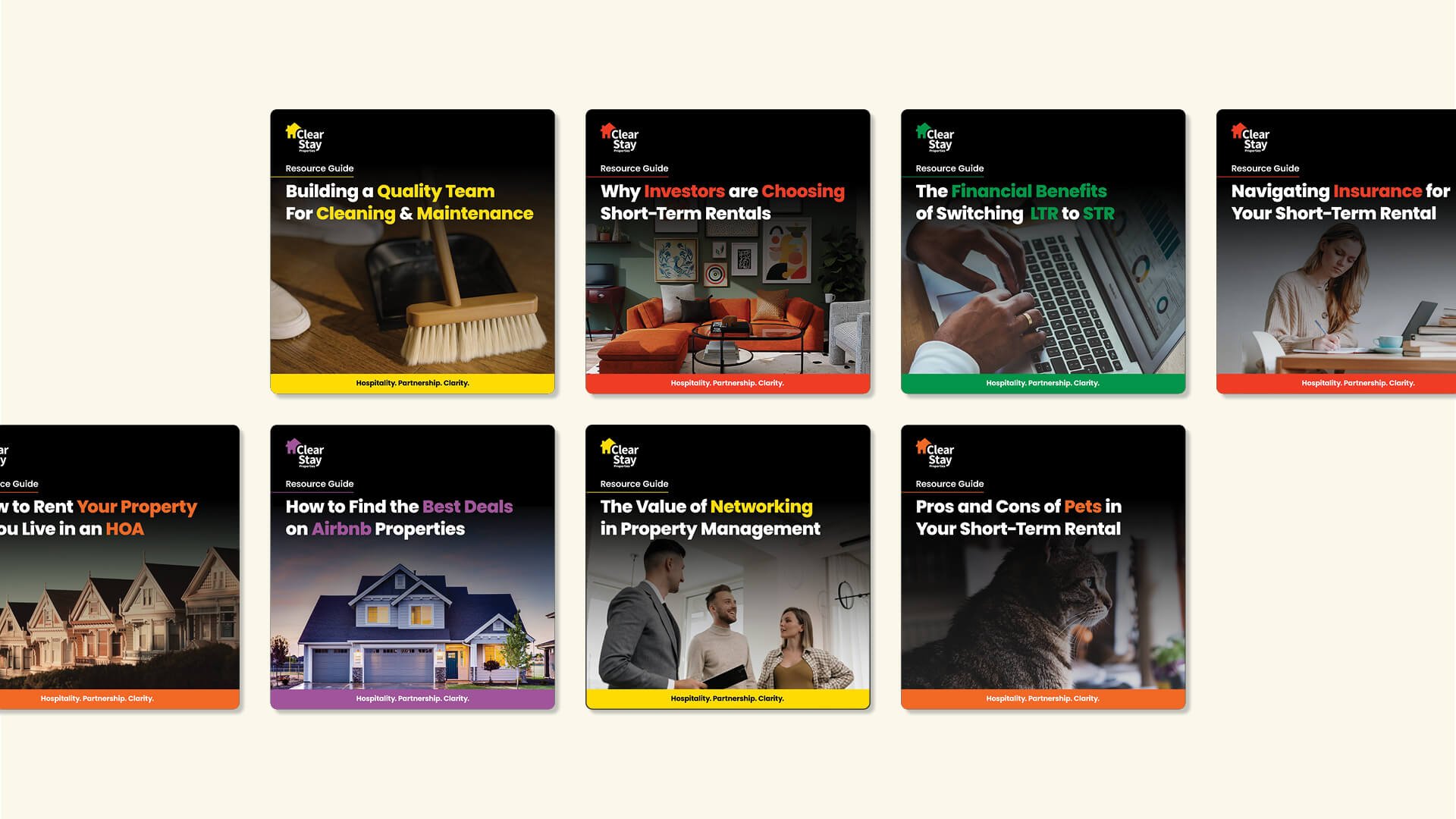
Visual Identity: Inspired by brands like FedEx, the logomark emphasizes legibility, trust, and hidden meaning. A modular color system distinguishes each sub-brand by theme (guest experience, technology, marketing, etc.).
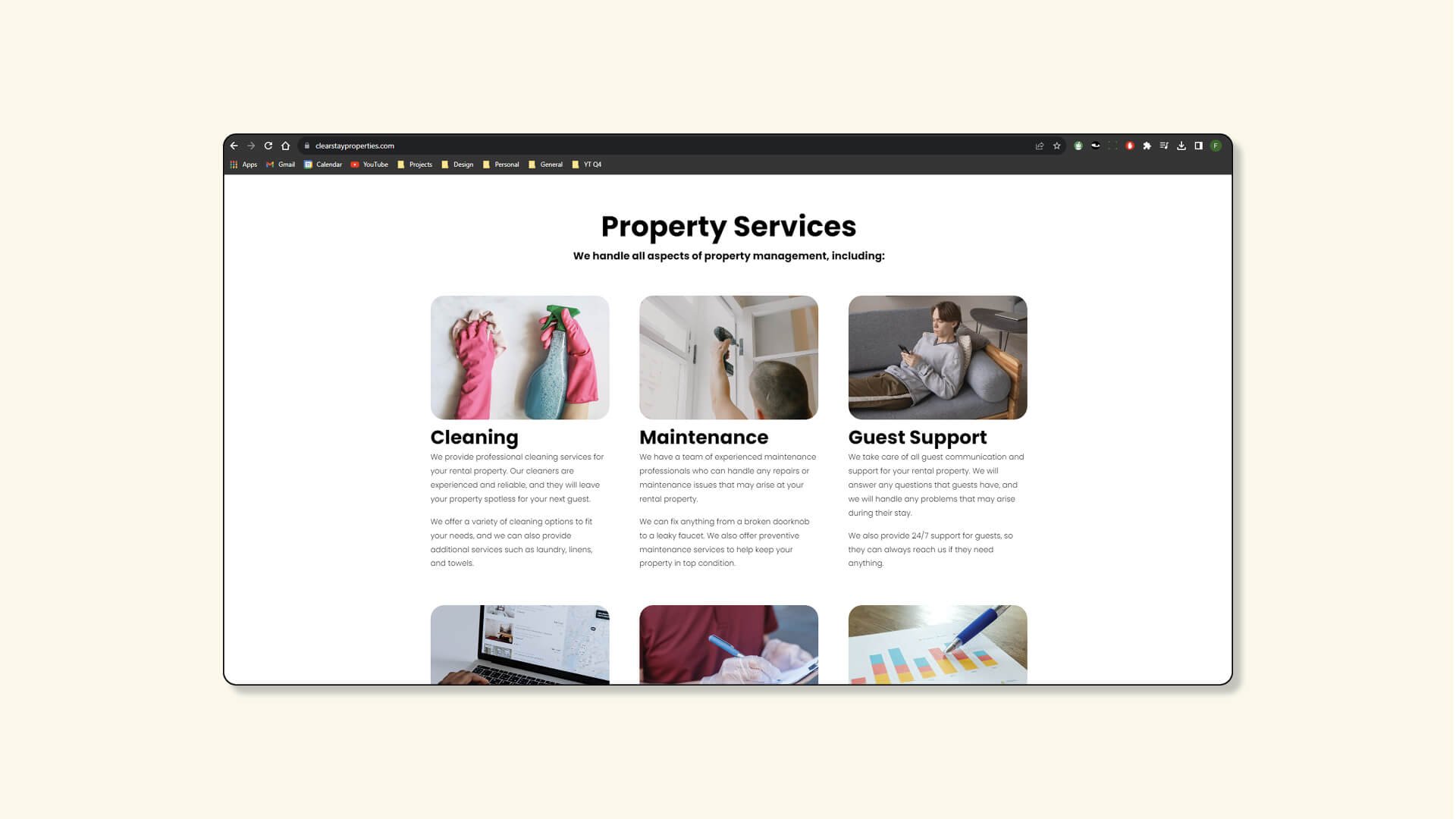
Web & Content: Built in Squarespace for long-term founder ownership, the site was structured around blog-ready content blocks and scalable navigation making it easy to grow with the business.
Motion & Social Strategy: A lightweight custom animation language was introduced across social and web to drive engagement without overwhelming. Every element was designed to be replicable by a small internal team or freelancers.
Clarity at the Core

Positioned to Expand
With Airbnb-style rentals on the rise, Clear Stay needed a system that could stretch. The brand was architected to support future niche sub-brands and geographic growth — each with its own tone, while staying tethered to a cohesive master identity. Social media and lead-gen frameworks were designed to support expansion from day one.